Patient Treatment Classification
A scrollytelling version of this project can be seen in here. Viewing this version in desktop is highly recommended
Introduction
A revisit on my graduate coursework final project. A project that was meant to show my understanding in statistical analysis, by analyzing a dataset, picking and justifying a model used, and writing a report. This project analysis has been extended through adding more comprehensive metrics that can be adjusted for different scenarios.
The purpose of this analysis is to find out what kind of treatment a patient should be given, based on their blood test and some personal informations.
About the Dataset
The dataset contains 4412 blood test results from an Electronic Health Record in an Indonesian private hospital. It is a clean dataset that does not have any irregularities as far as I know (I do not have any medical background). It also have a balanced split between treatments, and sex. Minimal data cleaning was done for this dataset.
Analysis
There are three main types of blood cells are included in this test, which are red blood cells, white blood cells, and platelet. Irregularities amongst these three blood cells may indicate problems in one’s health.
| Name | Description |
|---|---|
| HAEMATOCRIT | Volume percentage of red blood cells in blood. |
| HAEMOGLOBIN | A protein containing iron that facilitates the transportation of oxygen in red blood cells. |
| ERYTHROCYTE | Count of red blood cells, which carries oxygen throughout the body. |
| LEUCOCYTE | Count of white blood cells, which helps protect the body from infection, etc. |
| THROMBOCYTE | Count of platelet, which is used to coagulate blood and form blood clot. |
| MCH | Mean Corpuscular haemoglobin, average mass of haemoglobins per red blood cells. |
| MCHC | Mean corpuscular haemoglobin concentration, concentration of haemoglobins in a volume of red blood cells. |
| MCV | Mean corpuscular volume, average size of red blood cells. |
| AGE | Age of patient |
| SEX | Sex of patient (1 = Male, 0 = Female) |
| SOURCE | Given treatment (1 = In-care, or 0 = Out-care) |
The blood test result contains many correlated metrics. This might pose a future problem for some models that we are planning to use. Correlated features can confuse some models that assign independent effect to each feature, this problem is called multicollinearity. Red blood cells seems to be referred to by multiple metrics while the other type of blood cells are referred once.
Features Correlation
To confirm and quantify the existance of multicollinearity, we should see the correlation map. Then, we can handle the multicollinearity through feature selection.
Multicollinearity
To quantify the correlation, let us see the correlation map. The map gives correlation number to each features that ranges from -1 to 1 for negative and positive correlation respectively.
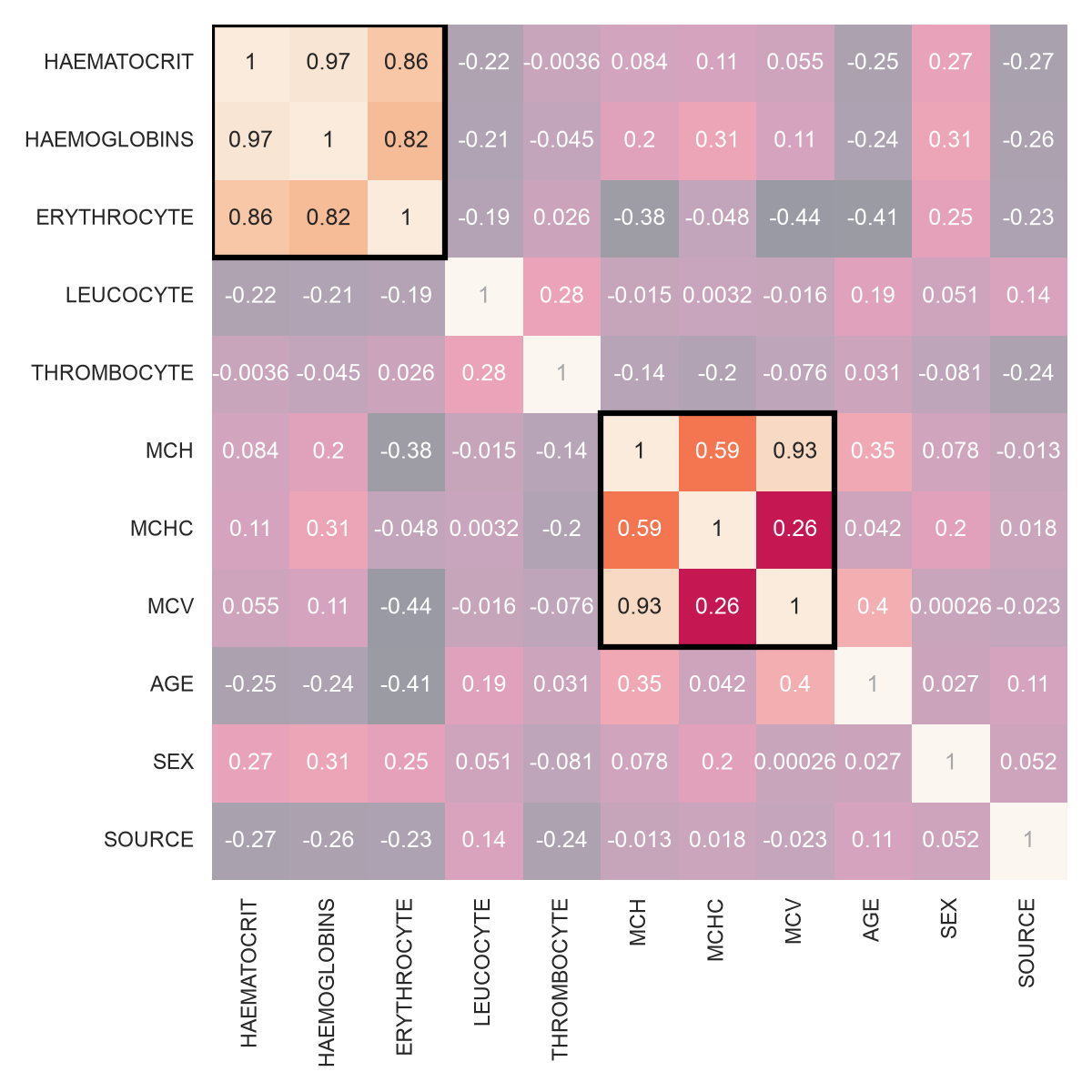
Figure 1 shows two clusters of features that have high to moderate correlation. The first cluster of correlation contains HAEMATOCRIT, HAEMOGLOBINS, and ERYTHROCYTE. They describe about the amount of red blood cells in a patient body. The second cluster of correlation contains MCH, MCHC, MCV. They describe about the information of red blood cells in a patient body.
Variance Inflation Factor (VIF)
Now we can proceed to feature selection. We will be using VIF to do it. The VIF explains how well can that feature be predicted by a linear combination of other features. The higher the VIF, the stronger that relationship is. A rule that is generally used is, where we discard a feature iteratively that have the biggest VIF and have more than 10. Table 2 visualizes how the iterative feature selection works.
| Feature | VIF |
|---|---|
| HAEMATOCRIT | 4826.715 |
| HAEMOGLOBINS | 5135.342 |
| ERYTHROCYTE | 2163.380 |
| LEUCOCYTE | 4.778 |
| THROMBOCYTE | 7.092 |
| MCH | 11726.363 |
| MCHC | 2683.858 |
| MCV | 5936.488 |
| AGE | 7.794 |
| SEX | 2.430 |
| Feature | VIF |
|---|---|
| HAEMATOCRIT | 4208.054 |
| HAEMOGLOBINS | 1609.287 |
| ERYTHROCYTE | 964.276 |
| LEUCOCYTE | 4.777 |
| THROMBOCYTE | 6.969 |
| MCHC | 1172.767 |
| MCV | 1143.541 |
| AGE | 7.632 |
| SEX | 2.427 |
Notice that in the first step, MCH is the candidate to be removed since it has the highest VIF and it is more than 10. In the next step, all of the VIF is recalculated and a new candidate is chosen.
| Feature | VIF |
|---|---|
| ERYTHROCYTE | 8.480 |
| LEUCOCYTE | 4.399 |
| THROMBOCYTE | 6.671 |
| AGE | 4.649 |
| SEX | 2.268 |
Finally, we have the final result as shown in Table 3 since we do not have any VIF that is more than 10. Surprisingly, it removes the second cluster of correlation completely. Of course, I do not have any medical background in order to justify or oppose this decision, it is purely technical. Therefore, for models that have issue with multicollinearity, there will be a version that uses strictly selected features. These models will be indicated by the suffix ‘-R’ for reduced.
Features Distribution
To see whether features are different enough between treatment class, we check every features’ distribution. It will give us a clue whether these features can distinguish between patients that are given In-care treatment and Out-care treatment.
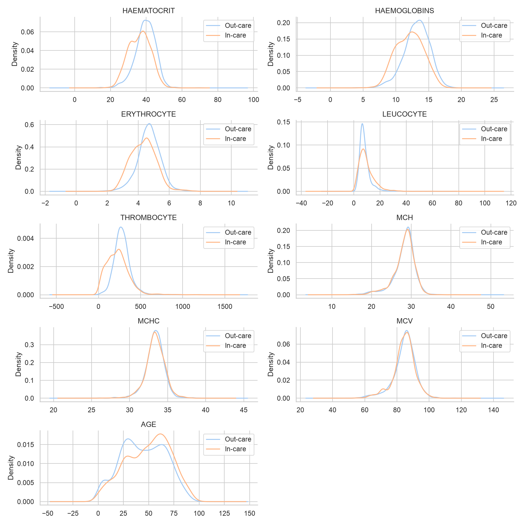
The distributions of every features separated by the given treatment shows that there are barely any difference between the two. This means that the features might not be able to distinguish which treatment a patient should be given. From here, the expectation of the prediction result should drop down.
Metrics
To measure the performance of our models, we will be using 3 metrics. One main objective, while keeping the other two metrics in mind. However, all of these metrics are correlated, and some kind of trade-off should be in consideration. Not to mention, there is a difference in consequences where missing an In-care treatment is a big deal while missing an Out-care treatment, not so much.
First, we should keep in mind that in a two class classification, we have the following truth table.
| Predict: Out-care | Predict: In-care | |
|---|---|---|
| Actual: Out-care | True Negative (TN) | False Positive (FP) |
| Actual: In-care | False Negative (FN) | True Positive (TP) |
Misclassification Rate and Expected Cost
As mentioned, there are different consequences for wrong prediction. Hence, it makes sense to punish predictions that misses In-care treatment (False Negatives). This ‘punishment’, we will refer to it as cost. As a consequence of this decision, the model will be more likely to predict In-care treatment by the same ratio as the cost ratio.
When the cost is 1, the ratio is 1:1, the main metric we will use is misclassification rate, given by Equation 1. \[ \text{Misclassification Rate } = \frac{FP + FN}{\text{Total predictions}} \tag{1}\] \[ \text{Expected cost} = \frac{ FP + (cost)(FN)}{\text{Total predictions}} \tag{2}\]
When the cost is bigger than 1 however, we will multiply false negative by cost as shown by Equation 2. We can no longer call it misclassification rate, so we will call it expected cost.
Sensitivity and Specificity
Important to keep in mind, both types of wrong prediction affect the main metric. We want to know which type contributes the most, so we will include the additional two metrics to see that.
\[ \text{Sensitivity } = \frac{TP}{TP + FN} \tag{3}\] \[ \text{Specificity } = \frac{TN}{TN + FP} \tag{4}\]
Sensitivity, shown by Equation 3, can be described as, among patients that are actually given In-care treatment, how many of them were predicted by the model correctly.
Equation 4 or specificity means that among patients that are actually given Out-care treatment, how many of them were predicted by the model correctly.
Model Training and Result
Here is the list of models that are used. 1. Logistic Regression (LR) 2. K-Nearest Neighbor (KNN) 3. Generalized Additive Model (GAM) 4. Decision Tree (DT) 5. Ensemble Methods (Random Forest (RF) and Gradient Boost (GB)) 6. Support Vector Machine (SVM)
The step by step, justification, and details of this model can be seen in the technical version.
When Cost is 1
When the cost of false negative is equal to one, KNN model reaches the lowest expected cost by a small margin. But, it does have higher variance compared to the next best models, which are SVM and GB
Do note that this is under 5-fold cross validation, it is not exactly an ideal number of fold to reduce the variance, but it is what my machine could handle.
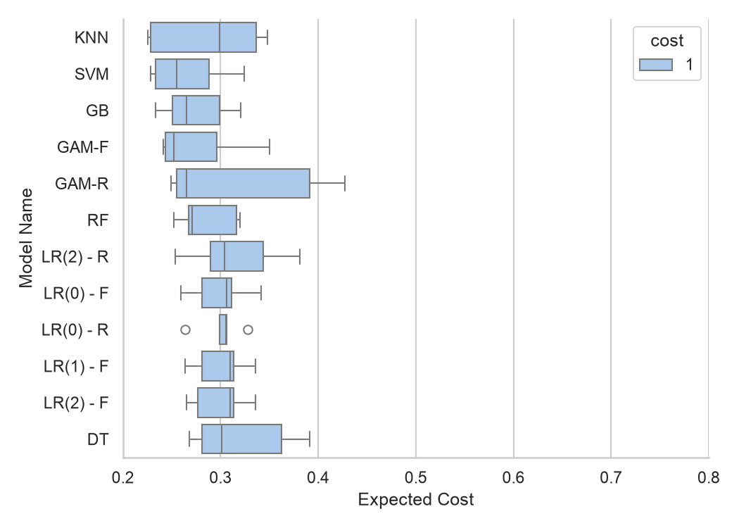
The top 5 performing models sorted by mean expected cost are
| model name | mean expected cost | std expected cost | mean sensitivity | std sensitivity | mean specificity | std specificity |
|---|---|---|---|---|---|---|
| SVM | 0.265882 | 0.040164 | 0.563652 | 0.076877 | 0.837675 | 0.103816 |
| GB | 0.27381 | 0.035790 | 0.566912 | 0.058274 | 0.832633 | 0.057580 |
| GAM-F | 0.276759 | 0.046687 | 0.497475 | 0.071868 | 0.875842 | 0.028997 |
| RF | 0.28537 | 0.030622 | 0.555648 | 0.051986 | 0.820286 | 0.053320 |
| KNN | 0.287652 | 0.058187 | 0.455793 | 0.060892 | 0.884581 | 0.049251 |
The models performed very similarly to each other. Most of the difference comes from the standard deviation (std), shown by how large the box is in Figure 3.
Do note that we have around 45% - 56% for the top 5 models, meaning that we missed around half of the patients that actually needed In-care treatment, which in this context, it is really bad.
When Cost is 3
Now, when the cost of false negative is set to three, we can see that the expected cost for KNN model shot up, and no longer the candidate for the best model. SVM and GB stays consistent, and RF model has a significant decrease in variance.
GAMs have also some reduction in variance, but it does contain a significantly high outlier. 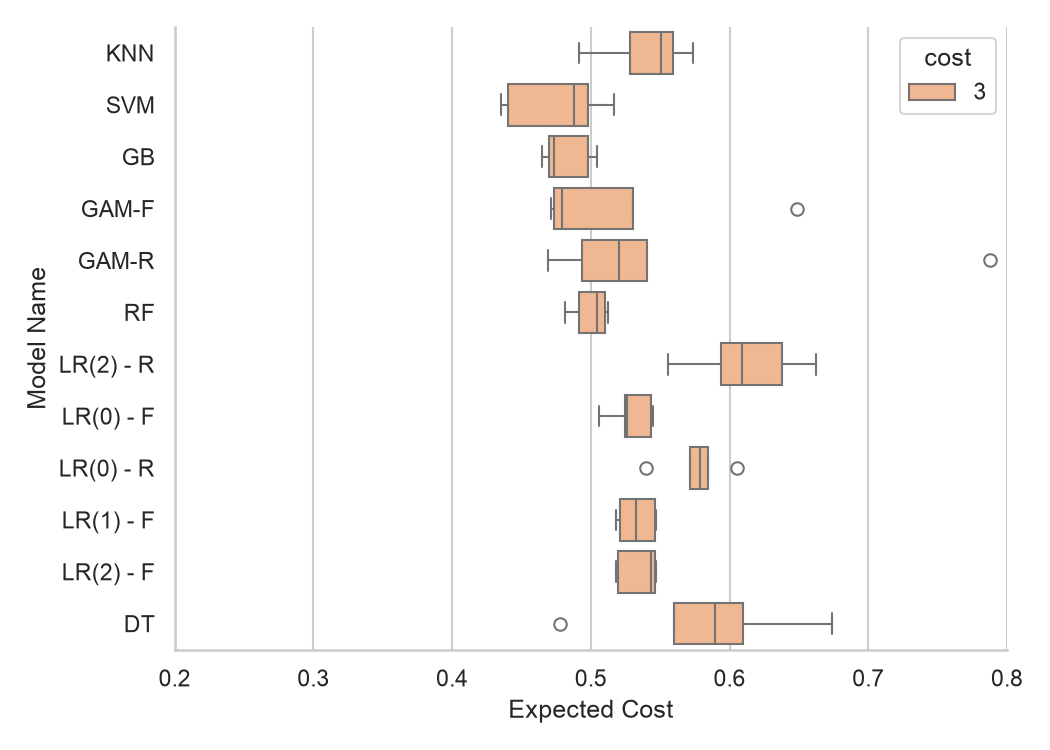
| model name | mean expected cost | std expected cost | mean sensitivity | std sensitivity | mean specificity | std specificity |
|---|---|---|---|---|---|---|
| SVM | 0.475753 | 0.036083 | 0.837901 | 0.058034 | 0.519768 | 0.095211 |
| GB | 0.482099 | 0.017803 | 0.834645 | 0.030494 | 0.516148 | 0.074274 |
| RF | 0.500006 | 0.013243 | 0.845373 | 0.061724 | 0.455518 | 0.149082 |
| GAM-F | 0.520648 | 0.075539 | 0.806976 | 0.074577 | 0.53078 | 0.096977 |
| LR(0) - F | 0.529013 | 0.015728 | 0.889955 | 0.043790 | 0.328295 | 0.126786 |
We see a significant improvement in sensitivity, meaning we didn’t miss a patient that needed In-care treatment as much.
Comparison
We can really see the difference in expected cost, and how it affected the variance due to the threshold of predicting In-care treatment being lower.
Note that the suffix ‘-F’ or ‘-R’ indicates whether the model use all features or reduced features. The number in parentheses for Logistic Regression (LR) models indicate the penalties used. For more details, do check the technical file.
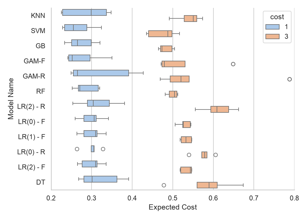
Of course, now comes the question, which model performs the best.
Looking at the metrics alone, SVM consistently performs the best followed by GB, RF, and GAM-F. But, there are additional things to consider. This is very apparent in the technical side, but it all boils down to the cost of performance and interpretability.
SVM and GB, required a lot of hyperparameter tuning and because of that, it also takes the longest to train. Due to the constraint on my machine, none of these 4 models mentioned are optimized.
Some models such as RF, GB, and GAMs provide interpretability due to the structure of the model and how the model is specified (for GAM only).
Interpretable Results
Feature Importance
RF and GB provides feature importance, where it scored what feature is deemed important by the model. Both models says that THROMBOCYTE is the most important feature. 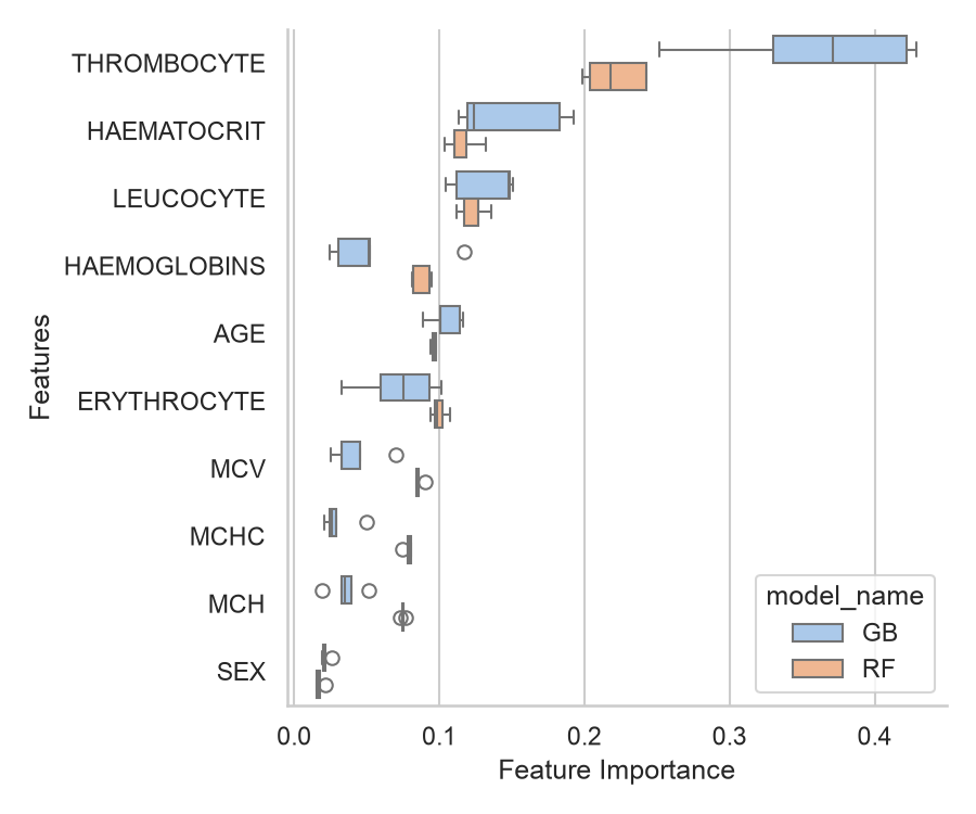
Partial Dependence
Meanwhile, GAM-F provides a partial dependence for each features where it displays the relationship of each features with the target. Notice that the jagged red line, the confidence bands are going wild for features that have high correlation. 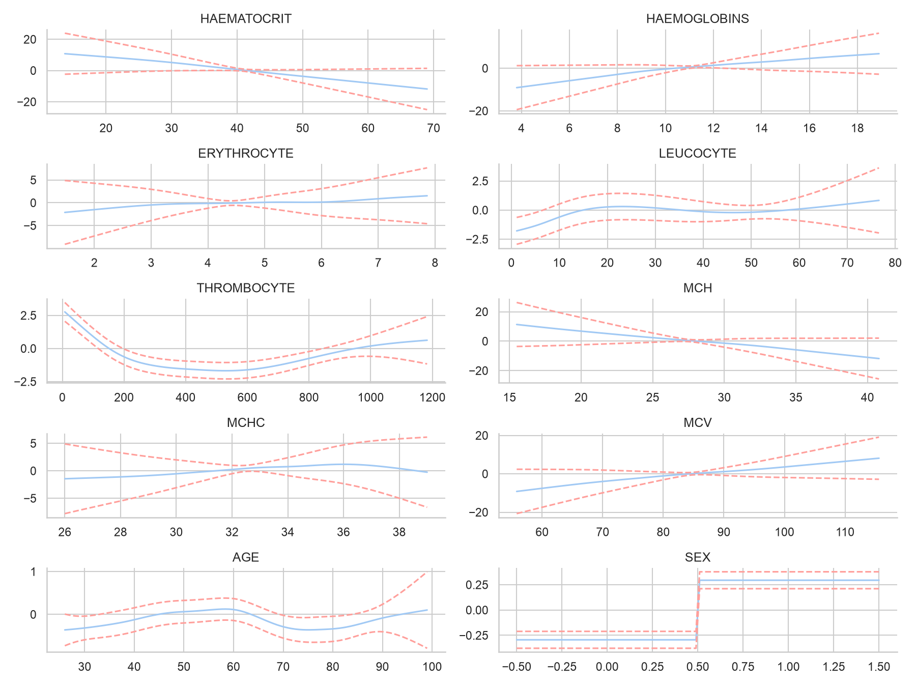
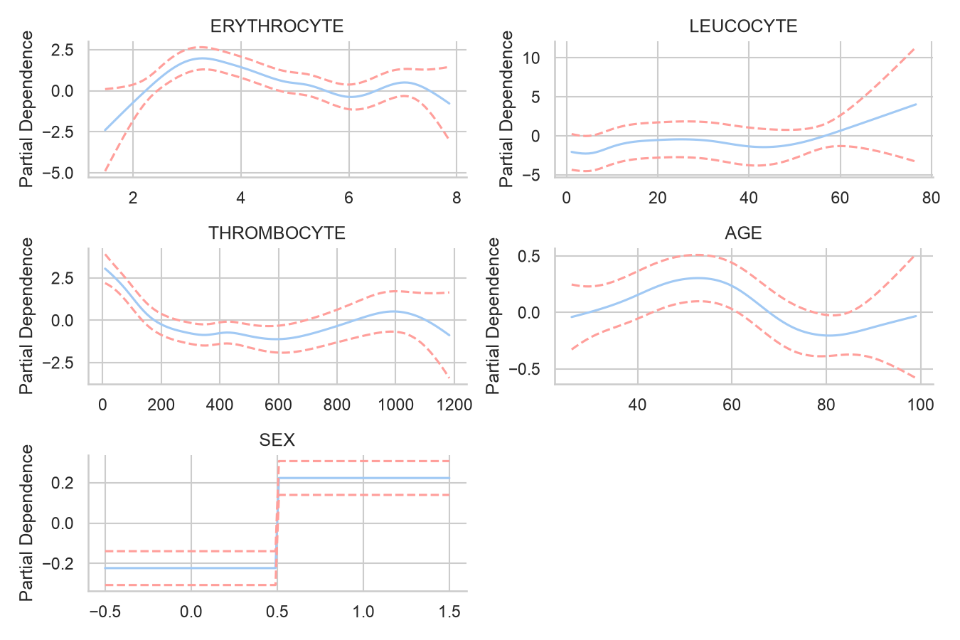
If we see the partial dependence provided by the reduced model however, we can see the confidence bands are much more stable. To read this plot, for example, for patients that have 0 to around 40 in LEUCOCYTE, they are more likely to be given Out-Care treatment, while patients that have more than that are more likely to be given In-care treatment.
Conclusion
So, what is the best model really? That completely depends on what the goal is. If it is purely prediction with no regards to training time, then SVM or GB should be the best. However, once we consider interpretability, and performance, it gets unclear and completely depends on what resource we have.
Is there a best cost ratio? The best cost ratio is determined on the objective of the prediction. Raising the cost for false negative will make the model to predict more In-care treatment for patients, so there should be a balance. How many missed In-care treatment can the hospital realistically tolerate? That is up to them.
One thing is clear from the beginning. Recall the distribution plot shown in Figure 2. We can’t really distinguish what kind of treatment should be given based on the blood test alone. There isn’t enough separation in the features that we can reliably make a prediction. I can spend a lot more resources and time to improve the prediction, but it won’t improve much and it will not be worth it.
Check out the technical version here
or the scrollytelling experience for desktop here